MOSCOW JUDO FEDERATION
A complete rebrand of the CIS region's premier judo organization. With respect for its legacy and a language the new generation actually reads
- Redesign
- Identity
- Merch
- Brand carriers
overview
A state institution can look sharp too. A full rebrand for the CIS region's premier judo organization
A complete rebrand of the CIS region's premier judo organization. With respect for its legacy and a language the new generation actually reads
overview
How we repackaged the judo federation
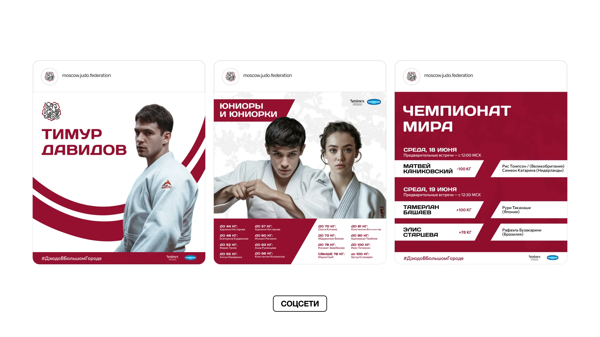
The federation came for a universal identity: the old one worked for the older audience but didn't register with young athletes. We ran a rebrand from the logo to fifty-plus branded items, and took every one of them into real production
the challenge
Update without losing the legacy
The main challenge. Keep the signature part of the federation's logo while making the branding legible for its younger members. The new style had to speak to two generations at once. Without choosing between them
logo
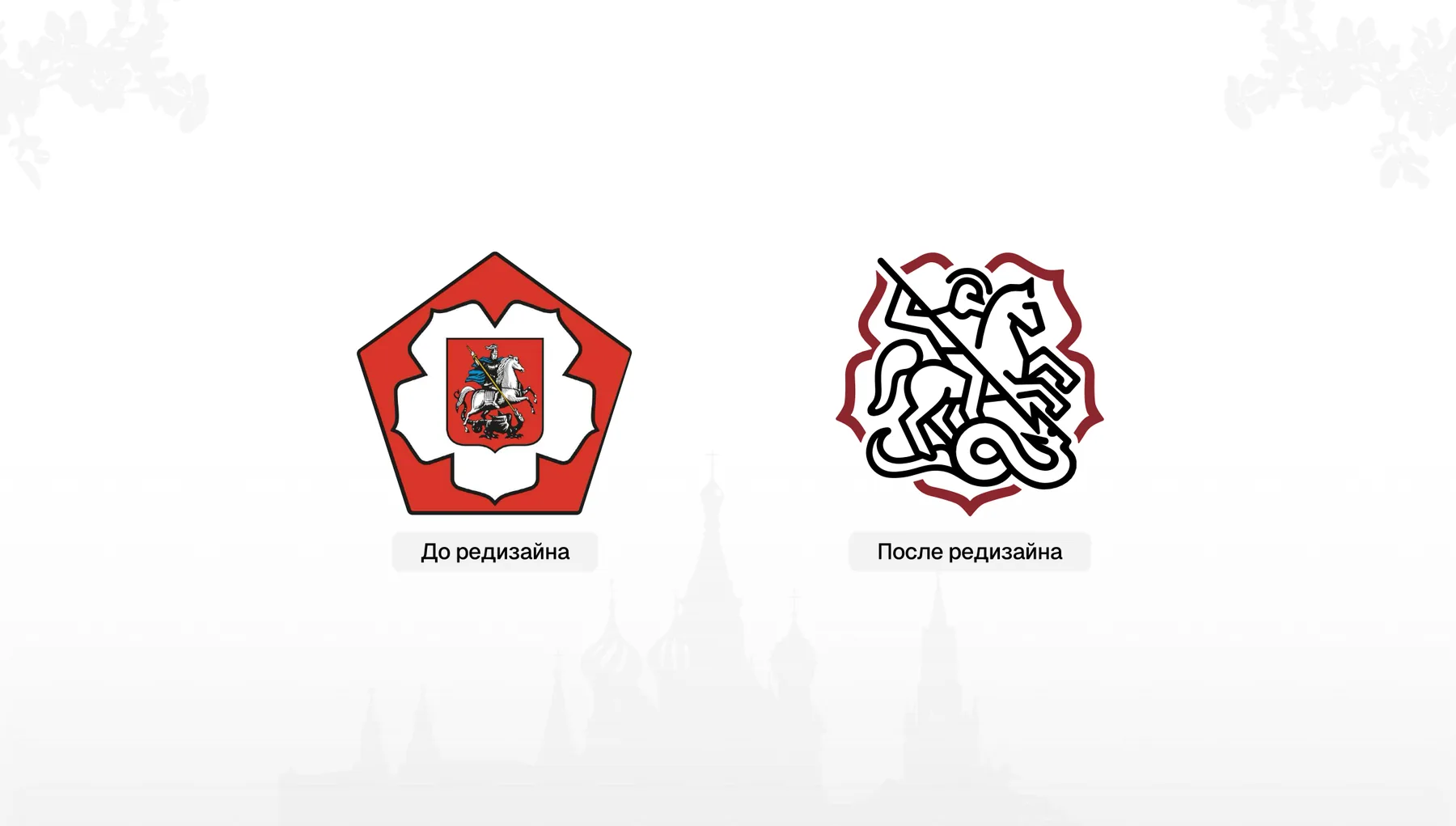
St. George in the language of a new generation
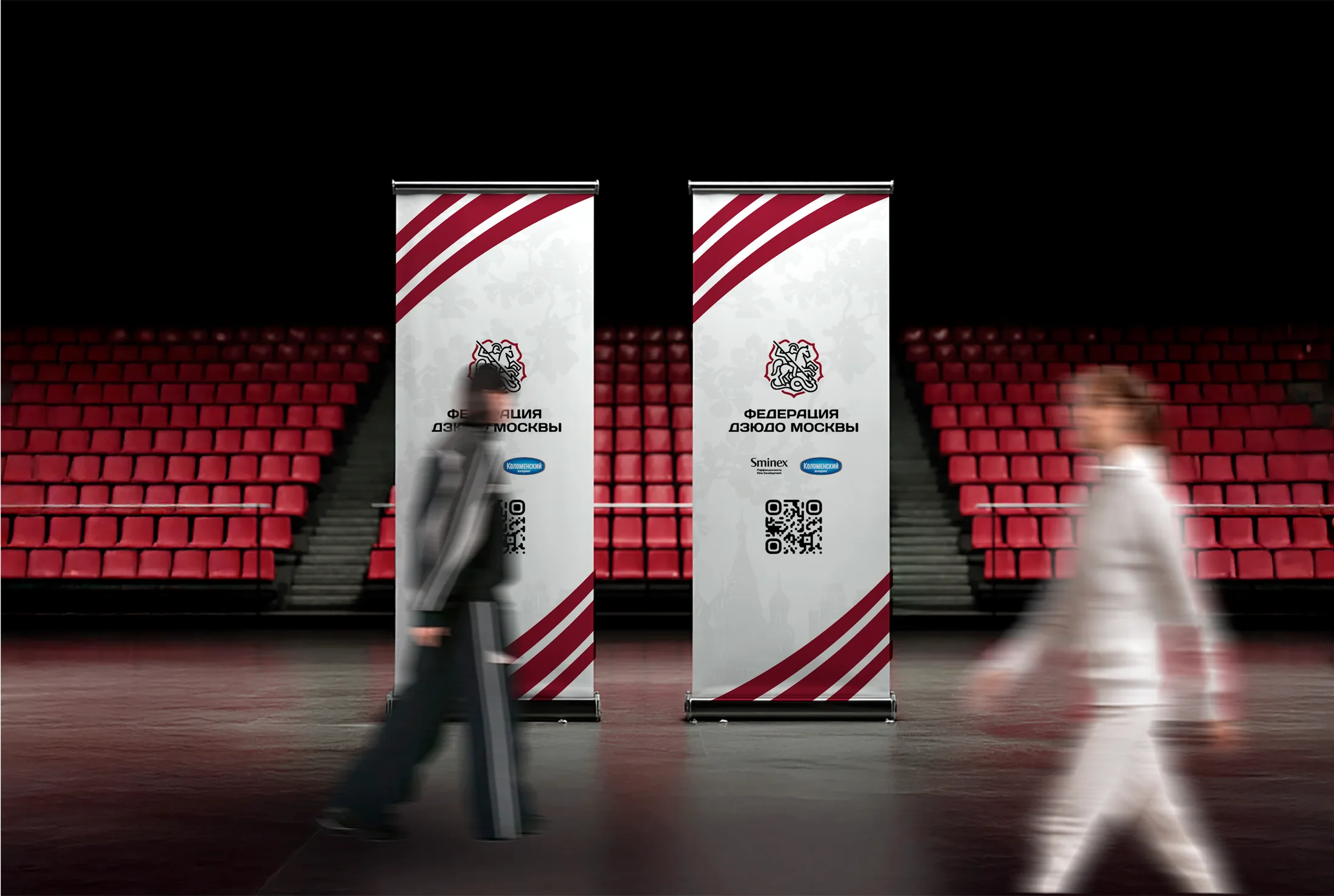
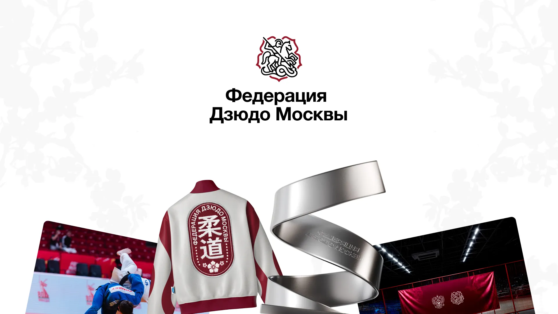
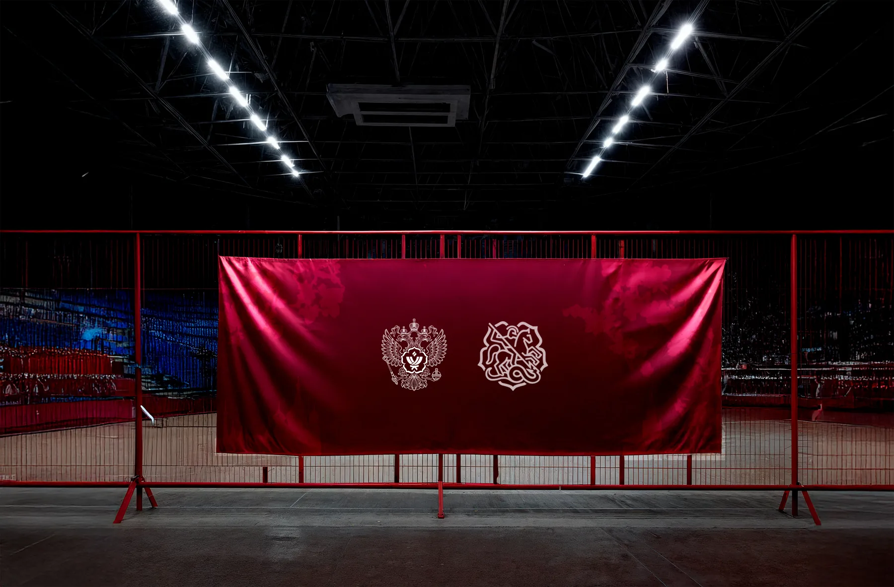
We kept the key elements of the mark. St. George, the symbol of Moscow, and the sakura behind him, but made the logo more handwritten and minimalist, adapting it to current trends. The legacy stayed, the read changed
identity & production
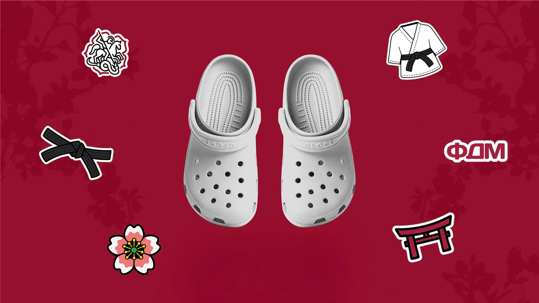
50+ branded items. From medals to Croc charms
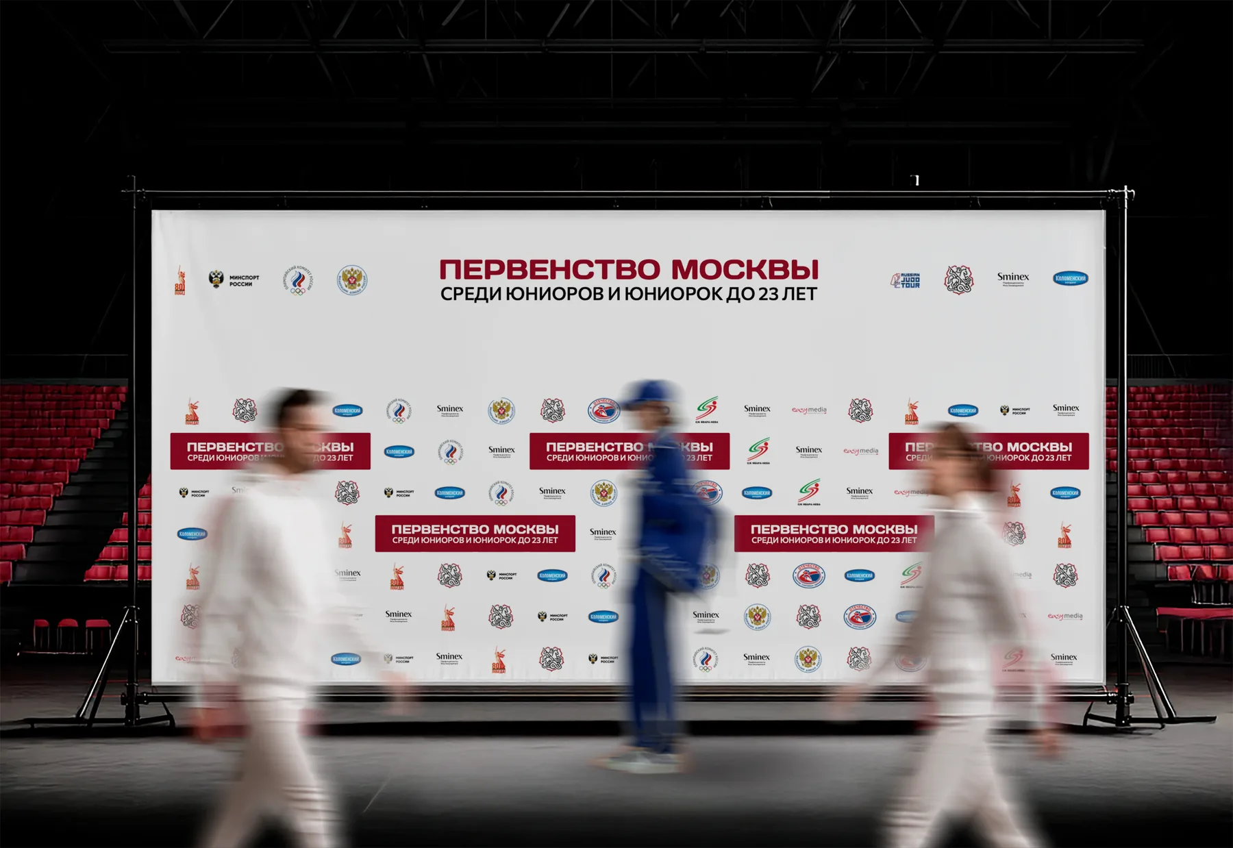
We created more than 50 carriers of the visual identity: team uniforms, awards and medals. Down to jibbitz for Crocs. We found a manufacturer for every single piece, supervised production and showed the style in real life: inside the federation and at competitions
result
A federation both generations recognize
A complete rebrand with its recognizable elements intact, 50+ items in production, and a visual identity that lives not in a brandbook but on the tatami, the podiums and the stands